the brief.
Allia Health Group operates as a vertically integrated digital health business: pharmacy operations, telehealth networks, and a portfolio of consumer wellness brands under one parent. The operation was sophisticated. The website wasn't: a placeholder from years earlier, out of step with the company it had become.
The timing made the gap expensive. Allia was positioning for a major liquidity event, and its most visible asset, the parent brand, signalled a soft, direct-to-consumer lifestyle company rather than the institutional platform investors were being asked to value. To hold its valuation in the room, Allia needed an identity that read as coherent, clinically credible, and scalable.
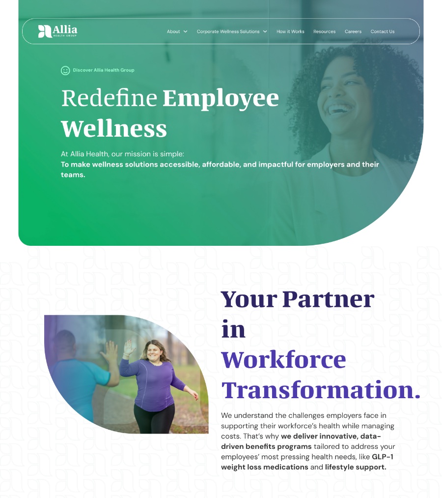 BEFORE
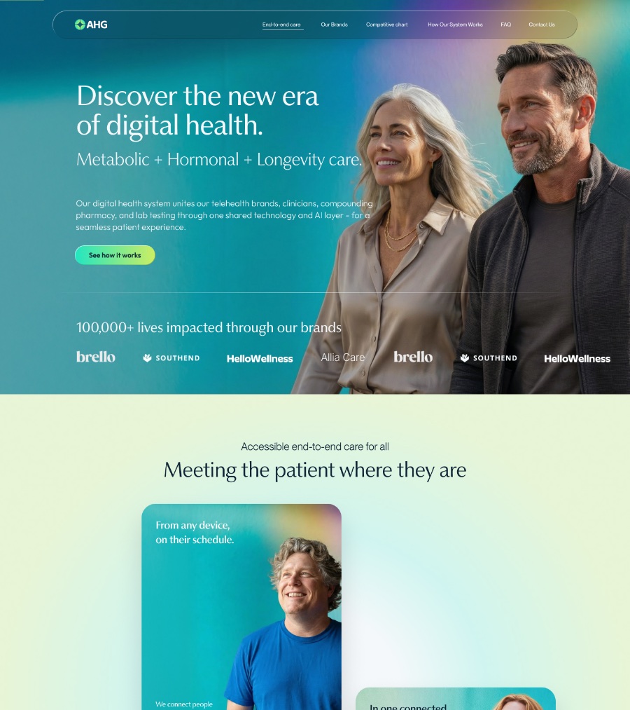 AFTER
AFTERthe challenge.
The portfolio was fragmented by design history. Sub-brands like Brello, HelloWellness, and Southend Pharmacy had been built in silos, each with its own visual language, and nothing tied them to a parent. The first brand explorations leaned into a high-voltage, neon "startup" palette (electric teal, lime, bright orange) that signalled consumer hype rather than clinical authority.
And the deadline didn't move. The parent identity and a ten-page, component-led site had to be designed, built, and live before the investor window in January. A traditional multi-month corporate rebrand was a luxury the calendar ruled out. We had to run the brand work and the build at the same time.
the process.
Enter POWER SHIFTER. We opened with a single high-collaboration briefing that put the decision-makers in one room on day one, then worked alongside Allia's communications partner, Wheelhouse, and its copy lead, so approvals happened in conversation rather than in queues.
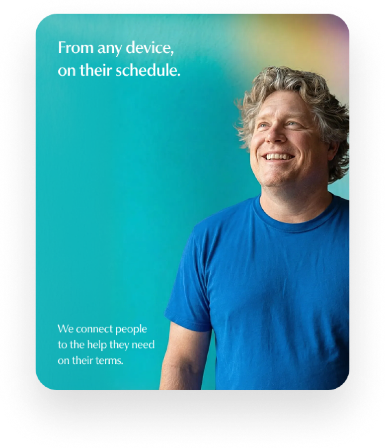
We split the work into two concurrent tracks: the Webflow build, and a two-week wordmark and brand-mark sprint. When the full stacked wordmark proved too wide for navigation and other small placements, we added an AHG monogram as a compact companion mark: one system, two registers. Early colour directions had skinned the brand in neon; guided by the client's reference points, we pivoted to a softer, clinically credible palette and held it across every screen. For imagery, we used generative AI to prototype and produce hero characters, lifestyle before-and-afters, and branded product shots: high-resolution art tuned to an institutional audience, without the cost or the calendar of a physical shoot. The work moved through weekly design gates: style tiles, wires, then production-ready Figma in days, not weeks.

 Monogram
 Unity symbol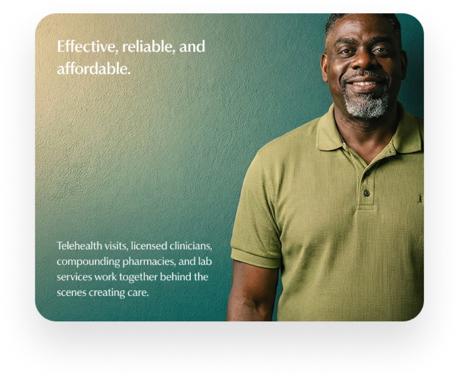
the solution.
A static site or a soft consumer layout would never satisfy institutional investors. We set a "humanized clinical" standard (clinical credibility with enough warmth to stay human) and built the parent brand to anchor everything beneath it. We built on Webflow because it let us prototype layouts at speed and keep high-fidelity UI and stable code in one environment, essential against the timeline. To add polish without dragging performance, we built lightweight micro-interactions natively in Webflow, so scroll reveals and state transitions stayed smooth without the overhead of bespoke JavaScript libraries.
systematic layout logic.
The interface establishes the parent as the orchestration layer, using tight geometric grids to show how the group's technology anchors its consumer-facing brands rather than competing with them.
component-driven flexibility.
We engineered an expandable ten-page modular component system, built to scale as Allia's clinical and B2B footprint grows: new brands and pages drop into the existing architecture.
a dual identity system.
A formal stacked wordmark for corporate and investor contexts, plus the AHG monogram for navigation, favicons, and app headers: legible from a pitch deck down to a mobile nav bar, retiring the neon for an institutional palette of clinical blues and neutrals.
the outcome.
We shipped the full rebrand and Webflow site inside the window, with the parent site live ahead of the January investor presentations, the fixed date the whole engagement was built around.
On launch, the site scored 96/100 for performance and 100/100 for accessibility, best practices, and SEO on Google's Lighthouse audit: fast, accessible, and technically sound from day one. We handed over a brand system and a style guide hosted for the team in perpetuity, and a Webflow CMS structured with custom collections and plain-language fields so the internal team can publish and update sub-brand content without coming back to us. Where there were silos, one extensible visual language now carries the parent and its portfolio.
The rebranded platform, live in the world it was built for.
Hover to playI cannot tell you enough how great it has been working with you and your team!