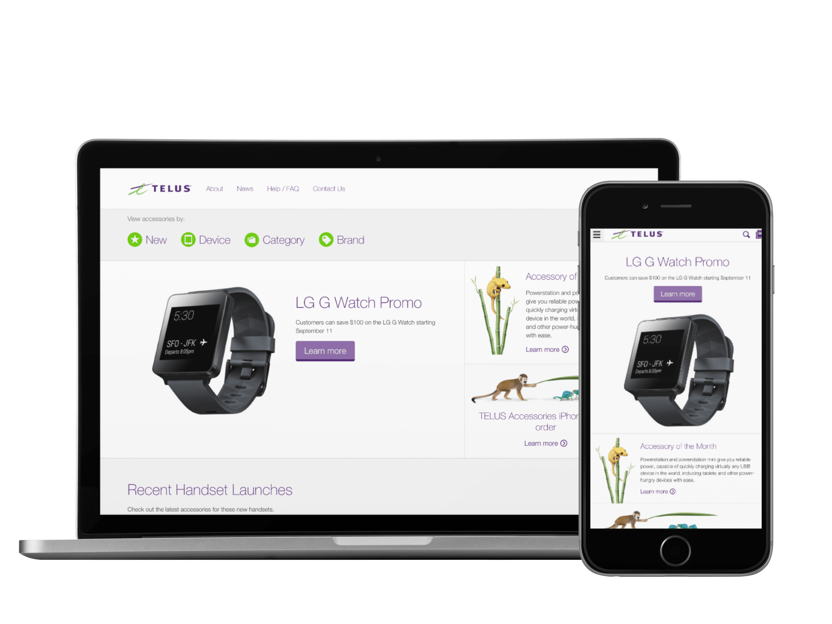
TELUS dealers used to learn about new accessories from a spreadsheet on a USB stick, mailed out monthly. We replaced it with a responsive catalogue (two brands, three dealer audiences) that dealers adopted and never left, and whose UX TELUS later carried into telus.com/shop.
the brief.
TELUS and Koodo sell phones, plans, and accessories, but their independent dealers were under no obligation to buy accessories from TELUS. They could source from any wholesaler, and many did, because TELUS made it hard to do otherwise. The merchandising "platform" was a USB stick carrying a flat spreadsheet of 700+ SKUs, updated monthly and physically distributed to a dealer network of a few hundred locations. No promotions. No new-product announcements. No way to see what an accessory actually looked like.
Dealers weren't using it at all, and every accessory bought elsewhere was TELUS revenue walking out the door. Customers were walking too, leaving stores empty-handed when the accessory they wanted wasn't on the shelf. TELUS Customer Solutions engaged Power Shifter to replace the USB platform with something dealers would actually want to use: a browsing and wish-list experience feeding TELUS's existing fulfilment system, built responsive, branded for both TELUS and Koodo, in English and French.
the challenge.
The brief looked light. We told TELUS it wasn't, that far more requirements would surface once we got into discovery, and proposed an agile, prototype-first approach the client wasn't accustomed to. That call proved out fast. A three-week discovery phase of stakeholder workshops surfaced the real shape of the problem: not one audience but three, with sensitive pricing walls between them. Corporate TELUS dealers needed MSRP and a TELUS-branded experience. Independent dealers needed the TELUS experience without MSRP visibility. Koodo dealers needed Koodo inventory, Koodo branding, and MSRP. All three had to be served by a single platform instance (separate builds were off the table) with independent dealers authenticating through their global TELUS dealer IDs via a separate portal.
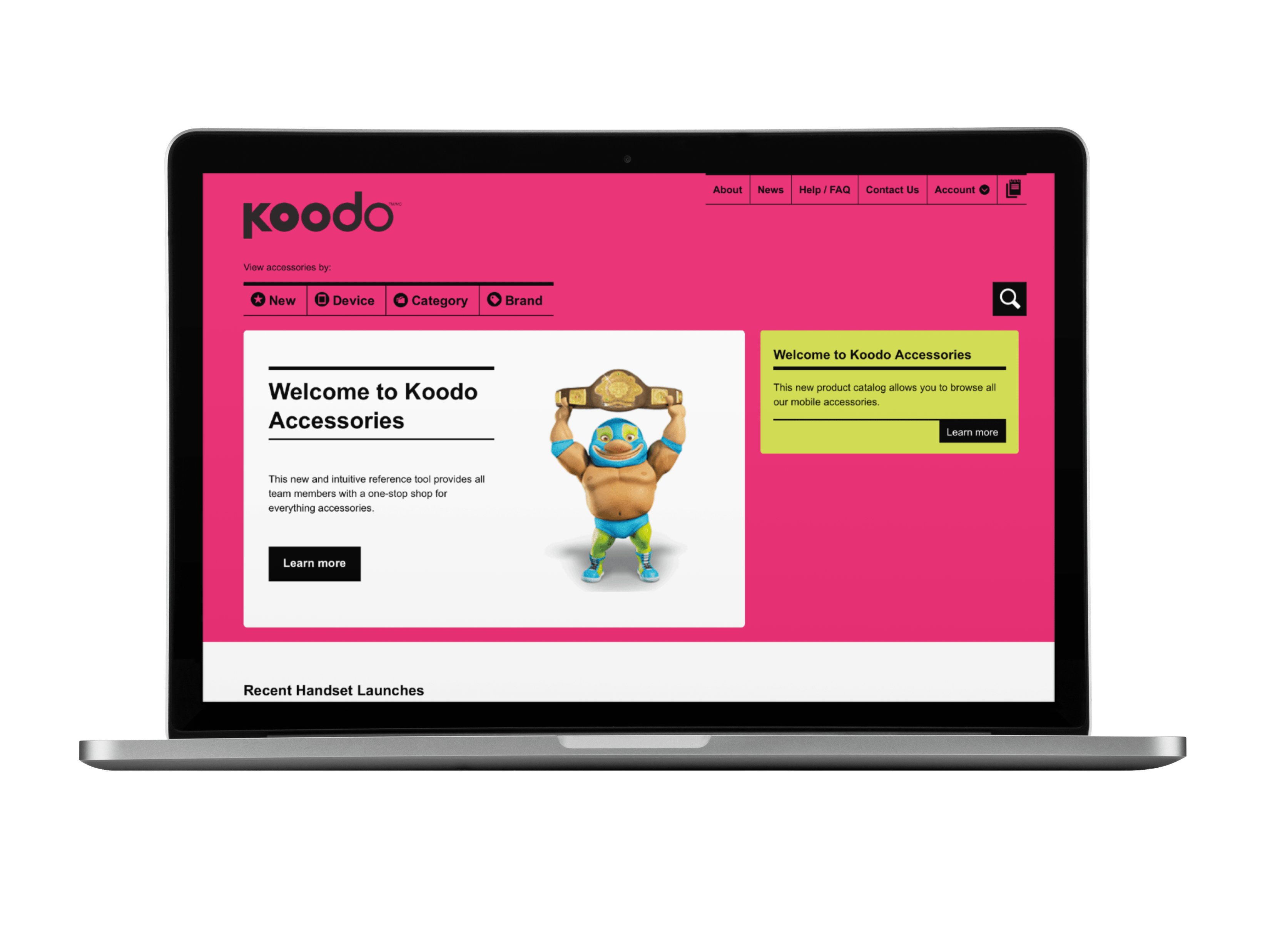
Then the wish lists: shared by multiple buyers per dealer location, without duplicate lists and double orders turning into a cost and logistics problem. And one constraint with upside: the Koodo experience would be the first responsive design ever produced for the Koodo brand, setting the precedent for every Koodo channel that followed.
the process.
Agile sprints, prototype first. Getting to a working prototype quickly meant gaps were found and closed while the project moved, instead of surfacing in a string of post-launch releases. The full team (strategy, UX, design, development, analytics) ran in parallel from day one through launch, so newly discovered requirements went straight into the build.
The decision that most changed the client's thinking cost nothing to build: we kept their spreadsheet. TELUS managed the catalogue in Excel, so rather than force a new workflow, we made the spreadsheet the ingestion path for the platform. The team that ran the USB process could run the new catalogue with almost no adjustment, and updating it took less time than before.
the solution.
WordPress was chosen for one specific reason: its user management framework gave our technical team the foundation to serve three strictly separated experiences (distinct pricing, inventory, news, and branding per audience) from a single instance, within budget. The data model parsed every SKU, banner, and bulletin to the right audience, and the admin experience was built so one administrator could publish to all three without ever leaking sensitive pricing across the wall.
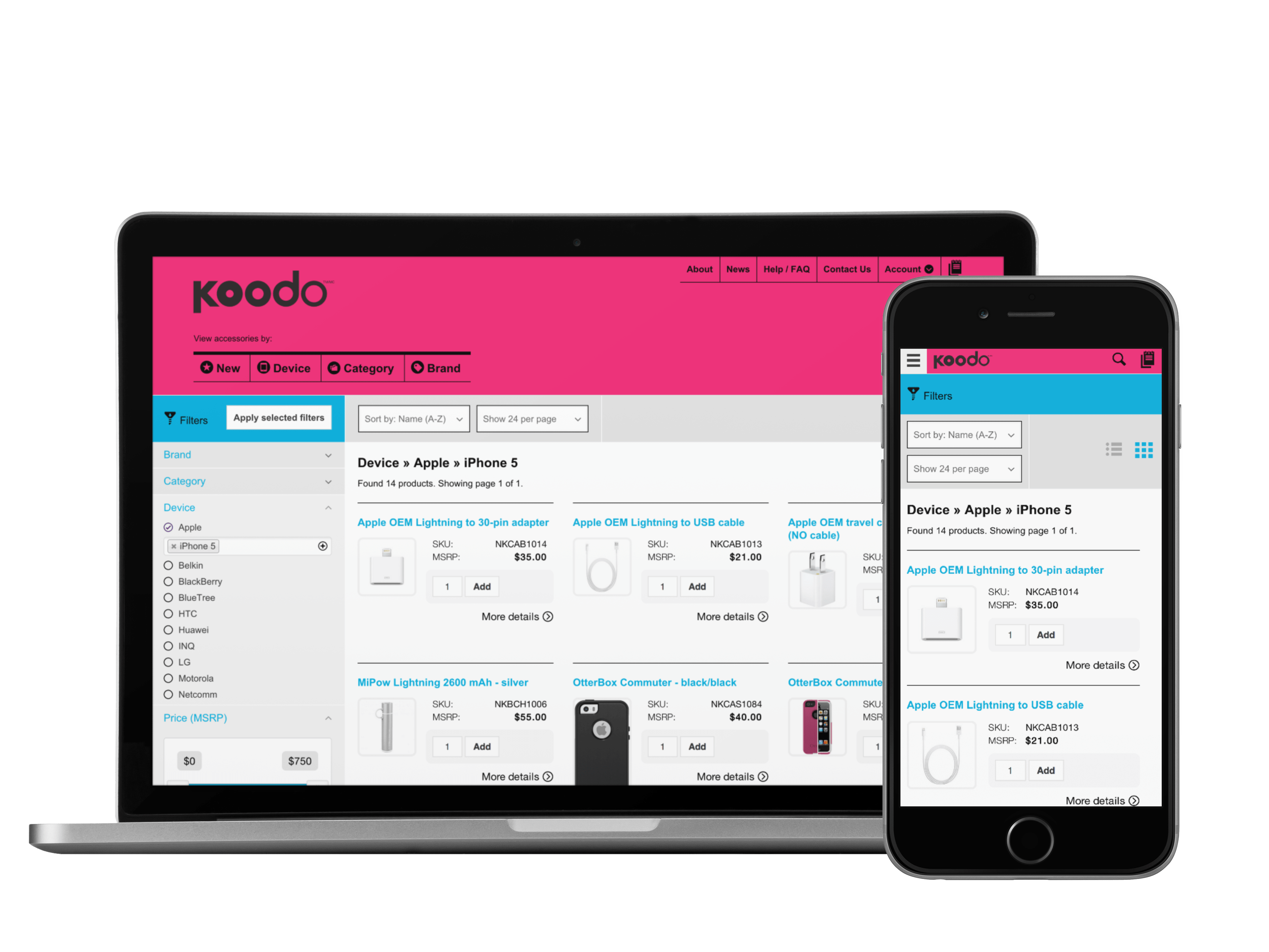
The catalogue UX took three weeks of hypothesis and testing on the filtering problem alone. The result let a dealer narrow 700+ SKUs to the right accessory in seconds, on a phone, a tablet, or the desktop at the back of the store. The shared wish-list system (built jointly by UX, front-end, and back-end) let multiple buyers per location research, build, and share lists that fed TELUS's fulfilment workflow, with no training and no FAQ required.
the outcome.
Adoption was the metric that mattered, and TELUS's own characterization was the one we'd design for again: dealers who switched would not go back, and many stopped ordering elsewhere. The monthly USB cycle (and the structural impossibility of promoting anything on it) was gone. TELUS reported the platform drawing 1,300–1,800 page visits a week at launch, climbing to 2,000–2,200 within months. One week logged 2,832 page visits from 253 unique visitors, against a dealer network of a few hundred locations, each sharing a single login.
Then the outcome nobody scoped: the production quality was high enough that dealers began turning the catalogue around on showroom floors, walking customers through accessories the store didn't stock, saving sales that previously left the building. A back-office tool became customer-facing because it could hold up.
A back-office tool, now facing the customer: live on the showroom floor.
Hover to playThe strongest validation came from inside TELUS. Their e-commerce team took the filtering and sorting experience we designed for dealers and leveraged it for telus.com/shop, the consumer storefront.
Monthly USB stick, mailed out to every dealer
Live responsive catalogue on any device
A firstFirst responsive design ever built for the Koodo brand
AdoptedDealer UX carried into telus.com/shop